Alaska Airlines
Travel Experience Hub
product design / UI / UX research / content strategy
The information surrounding the inflight products for Alaska Airlines had not been addressed or updated in several years. The request to update these content pages was to provide a more clear explanation of what guests can expect from each inflight experience, so that they can choose the right cabin for their travel.
Discovery and planning
-

Research
I started with collecting all existing research that had been conducted on our inflight products, and examining the current user behavior of these content pages.
-

Opportunity canvas
Next I held an opportunity canvas session with the main stakeholders in order to understand the problems they were trying to solve with their initial solution.
-

Analyze and plan
Synthesizing the results from the opportunity canvas and the known current user behaviors, I created an initial user flow that centered around a new hub page that would take our guests through our in cabin experiences.
Building stakeholder trust
One of the challenges of this project was managing stakeholder expectations. When the request for the work came in, it was formed with a solution already in mind. Part of my process was being able to understand the problem that the proposed solution was solving, and use that information to work towards a solution that would address the underlying issues while also providing the stakeholder with an experience that would meet their preconceived expectations.
I managed this relationship by bringing the stakeholder into the process early on through the opportunity canvas exercise. By including them in this exercise, we were showing them that their knowledge in this space was important in the process to finding the right solution. I then created a comprehensive plan for updating the experience while addressing all of their business needs and providing a cohesive user experience.
Creating and testing a comparison chart
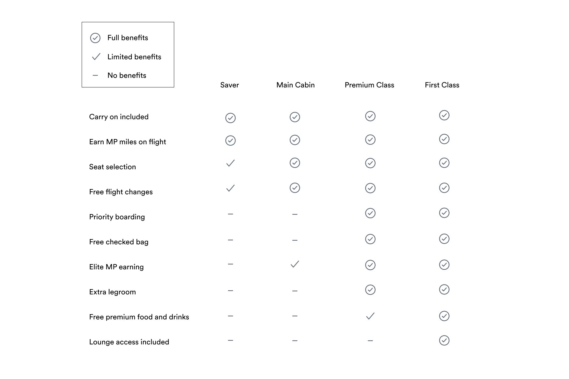
One of the features the stakeholder wanted to add was a comparison chart of the fare classes, so guests could compare what cabin features each cabin has at a glance.
Since this information lives within the content of the website, we were able to simplify our approach to the chart. We developed a chart that used plain language and iconography to show the distinction between each cabin type.
After the chart was complete, we needed to understand where it made sense to place it on the page. Using usertesting.com, we did a balanced comparison of a layout with the chart towards the top of the page and one towards the bottom.


Iterating & Final UI
-
Facilitation
I worked closely with UI and UX writer to take feedback from initial wireframes I had done to start putting together high fidelity layouts for stakeholder review.
-
Test and validate
I tested initial layouts with users to make sure we are validating our decision to lead with value propositions around the fare classes and then finish with the comparison chart.
-
Approve and launch
After validating our design decisions we presented final layouts to stakeholders and launched the new hub page experience.


Final MVP
In the end, the process for this project really made the difference. Bringing the stakeholders along through the journey helped them feel empowered and heard, and helped us get the buy in from them that we needed to launch.
Working closely with UI and UX Writing created a robust and rich solution complete with useful features, a clear and coherent voice, and inspirational imagery that proved to better engage guests and provide clarity in their fare purchases.


